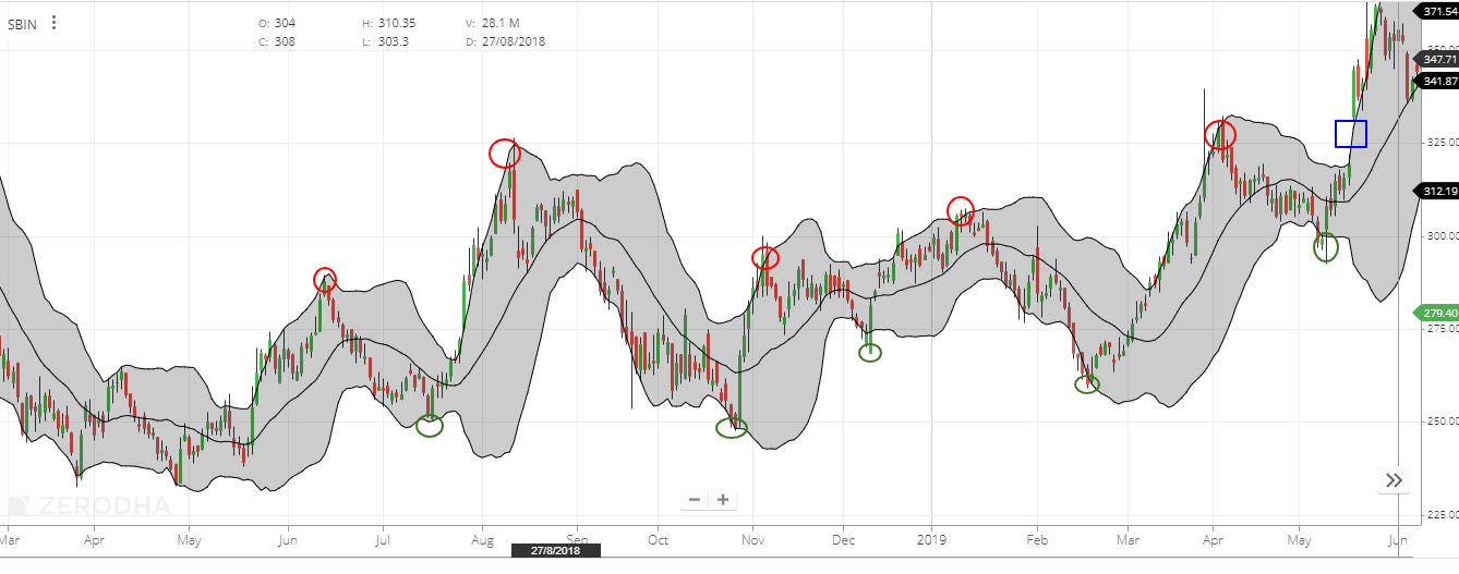
“Bollinger Bands” is a trend analysis method devised by American chart researcher John Bollinger.
Specifically, draw a moving average line for a certain period of time, and then draw two more lines above and below it. A total of 5 lines are drawn in a band shape, but by applying the statistics that most of the market fluctuations fall within this band (range), investment decisions are made based on the position and direction of the current price. is.
What is Bollinger Bands?
The Bollinger Bands consist of “TP (Tipical Price: Mean of High, Low, Close)” and “Standard Deviation“. It is a chart that draws the calculated width (standard deviation) as a band above and below the moving average value of a preset period (25 days, 26 weeks, 9 months is adopted for market speed). In statistics, when the data is normally distributed, the probability that the data will be within “mean ± standard deviation” is about 68%, and the probability that the data will be within “mean ± twice the standard deviation” is about 95%. Is known to be.
The Bollinger Bands take advantage of this characteristic. Wider bands mean more volatility (indicating how much the price of a product fluctuates over a period of time), and narrower bands mean less volatility. ..
Bollinger band settings
You can freely set the number of days, weeks, and months of the moving average in “Property 1” of “Preferences” of Market Speed. To see the big picture trends, you need to use the best combination to use for your own investment decisions.
How to measure trading timing using Bollinger Bands
How to measure trading timing
In the consolidating market, the price often moves within “mean value ± twice the standard deviation”, so sell when it breaks (approaches) the line of “mean value + twice the standard deviation (+ 2σ)”. It is a common practice to take a position and take a buy position when the line of “mean value-twice the standard deviation (-2σ)” is broken (approached).
Bollinger Bands Chart Example
Theoretically, there is a 95% chance that the price will move within “2 times the mean ± standard deviation” (between + 2σ and -2σ), so the price will approach the + 2σ or -2σ line. In that case, it can be said that it is a rare case in the past statistical data.
Therefore, when the price approaches the + 2σ line (red circle in the chart below), consider “sell”, and conversely, when the price approaches the -2σ line (green circle in the chart below), “buy”. Think about it. This technique works well in consolidating markets where historical statistical data tends to work effectively. Also, if the consolidating market continues, the band is narrowed due to low volatility, so it may come out of the + 2σ or -2σ line (the part circled by the blue square in the chart below). In that case, there are cases where the past statistical data does not work, so if you judge that you have entered a “new phase”, you may think that the place that crosses the + 2σ line is a “buy”, or- It is also necessary to think of the part that goes through the 2σ line as a “sell”. This technique works well when the market price rises or falls sharply.

When it passed (approached) the line of “mean value + twice the standard deviation (+ 2σ)”, it took a sell position and broke the line of “mean value-twice the standard deviation (-2σ)”. It is a common use to take a buy position when (approaching).
However, there are many examples of so-called “damage” in conducting such technical analysis, so avoid making judgments by looking at only one index as much as possible, and use it in combination with other indicators to make your own. It is necessary to find the buying and selling timing.
Also, keep in mind that it is very important to create your own investment rules such as loss cuts and follow them in order to make an investment.
[/membership_protected_content]

